Onboarding teardown of Zapier

Todays teardown is probably the leading no-code 'automation' platform that helps remove the repetitive tasks across different web applications you might be using. A simple example would be adding a new row to a google spreadsheet, every time you receive an order for one of your products via your online shop.
Considering the how technical this tool probably is under the hood, Zapier does an impressive job of hiding this complexity away and making it pretty simple for a non-technical user to set things up. There's definitely some snags a long the way but lots to learn from in terms of dos and don't on the onboarding front. So let's get into it!
Landing page - above fold

- First up is their main title which it clearly highlights the overall value prop which is automating your life! This is a consistent theme throughout
- It probably doesn't give you enough if you literally have no idea what the tool could do, but it's intriguing enough for you to dig further and find out more
- Following this, they highlight the crazy number of apps that they work with, 5000+ which means it's extremely likely they work with most if not all the tools you might use personally or at work
- Good differentiation between the primary and secondary actions they want you to take to remove any doubt about which action they want you to focus on
- It's clear, with the prominence of the sign up button, they want (and are expecting) the majority to go down the self serve sign up route.
- But more subtly, if you're a bigger business, the contact sales option is still clear too
- Important to weight your call to action buttons when you're offering more than one option so you remove as much thinking from the user as possible as to which one they should choose
- This is followed by super strong social proofing which makes you feel like you're in good hands with very well known logos
Landing page.- Below the fold

- Below the fold, Zapier progressively disclose more details to hook you in further in terms of the value of the tool
- You can gradually start to add more details as users scroll down a page because you know they are seeking out this information and will have increased tolerance for more detail
- The copy is a little gimmicky but continues to highlight the value proposition across different industries with a catch all for everyone but clearly a focus on business use
- There's some nice visual animations to put the tool into simple terms in the way you can link up different applications and how they interact with each other
- They also start with the basics, and gradually highlight more advanced functionality. It's obvious they want to make the point that it's not just a tool for less technical users, it's also great for people who might be more advanced
- The other thing you see from Zapier is the focus on benefits and value rather than features. This is important because customers don't buy 'features' they buy the value that they'll get from using those features.
Landing page - more social proofing

- Next up, some more social proofing but this time showing off what I'd call 'real life' feedback from every day type users that don't necessarily carry the big brand names or have been curated by the marketing department
- This can be really powerful because, the way it's displayed shows the volume of people having a great time using Zapier. Secondly, it's informal feedback everyone can relate to
- What's clever about this too is that there's no need to read every one. Even at a glance, you get a feel for positive comments across the board highlighting so many different benefits of automating through Zapier
Landing page - case studies

- If you're still keen for more, which I am :), you'll then reach the case studies section which is one of the most powerful ways to endorse your product
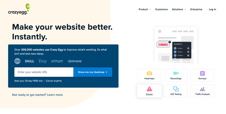
- This is because people are much more comfortable buying things that similar people like them have already purchased, something called the bandwagon effect that I mention in my Crazyegg onboarding teardown as well.
- These case studies do a great job of highlighting the main benefit or key metric that has been achieved using Zapier which really highlights the value
- You also start to get a better feel for the type of users they are targeting
Landing page - example zaps

- Finally, right at the bottom you reach the example zaps section
- This shows you some of the common 'Zaps' that you can setup between different platforms
- This is a great way to remove some of the barriers to someone getting started when they see a common relevant example to them about how the tool could be used
- I'd be tempted to have this higher up the page as a great way to encourage people create their first zap by clicking the try it now option on a common combination of tools they might already use
Onboarding - sign up form

- Pretty standard sign up form you see on most SaaS products these days. Option to either go down the social sign up route or the email sign up route
- It makes sense to push social sign up and have that as the first batch of options as means one less password for me to remember as a user.
- The mention of millions of users worldwide, automating with Zapier ,again reinforces the bandwagon effect that lots of people are already seeing value from using it. Feels like I'm missing out!
- They also do a very good job of reinforcing "automation" as a key term throughout the landing page and here. It's very clear to me that this tool is going to let me automate a whole bunch of stuff
- Nice confirmation that I'll be able to trial out the paid features but also that they offer a free forever plan of the core features
Onboarding - role and team size

- Hmm first step after signing up via email is asking more about me
- Have to say this was a little uninspiring, seeing a whole bunch of very samey grey boxes asking me about things that probably benefit their marketing department more than me
- Having followed the example apps route, I was expecting to be able to get stuck in and try them out. I'm a little underwhelmed that I have to jump through a few data collection steps first
- The other problem here in terms of UX is that there's no clear indication of how many steps I've got left. People are much more likely to complete the goal of signing up when it's really clear how much there is to do and how long it will take
Onboarding - select the apps I use
- This is more like it! Lots of familiar logos and looks like it won't be long before I've got these different apps talking to each other
- What's cool here is that I can select the apps I use and then I think Zapier will suggest the best ways I can use Zapier to create various useful workflows between them
- This is great because they put the value on a plate for me and hopefully I'm not going to have to figure out exactly what I could use it for
- There's also some nice subtle gamification in this step where they clearly know the more apps I add here, the more options they are going to be able to offer me to use the tool and make onboarding much stickier
- As I add each app, the progress bar moves up. It's amazing how powerful this visual clue is in motivating me to add 5 apps to complete it and get the bar 100% full
Dashboard

- OK, good news is even despite the lack of an indication of how many steps were left in terms of the initial onboarding, it was very short either way
- After completing it though, I'm thrown into a very cluttered dashboard
- There are so many different things trying to grab my attention it's really quite overwhelming
- There's so many different suggestions for what to do next, it's hard to know what's most important. Hicks law states the more options you give, the harder you'll make it for someone to make a choice.
- Surprisingly too, the one thing that would make perfect sense to make the most prominent part of the page are the recommended Zaps based on the apps I've already signalled I use
- Whilst this section is great and a much better way to get me setup with some Zaps on thigns they know I use, the most prominent areas are the create zap button and the Make a zap section.
- The problem with that is that they both start from scratch which means I'd have to again find the tools I want to use, when the recommended zaps are the ones they know I already use
- I'd definitely make the recommended zaps section the most prominent and push people towards that in the first instance
- The other thing I'd definitely do is to cut down the number of things trying to grab my attention. For example, despite only signing up 2minutes ago, I'm already being prompted to check out paid plans and upgrade in two different places
- This seems like a waste to me as very unlikely I'll be ready to do that right now, especially when I've literally just started my free trial.
- Also, by showing these straight away, it means they won't have the same impact and be as prominent if they popped up say a couple of days into my usage instead
- The other issue, I realised a little later on was that the usage scetion, which I think should just be hidden away until I've started setting things up, hides away some crucial navigation options like the help navigation link
- Anyway, lets create my first zap and see how that goes
Creating my first Zap


- Zapier prides itself on being a no code solution for non technical people so it's nice to see exactly this reflected in the UI with some really easy to follow steps to get started.
- All the clutter has finally gone and there are two clear steps I need to complete, the first giving me a nice intro video of the basics
- These explainer videos are really powerful to put things into context for people but only usually work when they are very short as people have very short attention span. For example, I watched it for 30seconds and decided I had enough info to dive in!
- Even though it was a bit annoying that I was driven towards creating a new Zap from scratch, they have at least retained the apps I signalled I use so they are just one click away from adding on so not much friction to getting started
- There's much less clutter on this screen too because it seems there's only the things that are vital to getting my first zap setup showing. This reduces the distractions that might otherwise be tempting to click on
- Once you start setting things up, there are a couple of useful things happening with the UI. Firstly, the status of my zap starts to flag up any areas I might have missed that are going to stop it from working properly
- Whilst this is quite useful, it's always better to prevent errors if at all possible from occurring in the first place. i.e The error I created was that I hadn't connected my Google account so that Google Sheets was connected but the UI allowed me to continue on to the next step knowing it would then show me an error.
- A better example of error prevention from Zapier is that it's simply never possible to publish your zap when it's in an error state. This at least stops me from expecting this zap is going to work if I was able to save and publish it.
- Next up I need to choose an action that will happen after my trigger fires. Feels like there is a missed opportunity here to show me most common actions based on the app I just said I wanted to trigger something from
- I decided to just choose email by Zapier to complete my zap of sending me an email whenever a new spreadsheet row is created in my Google sheet
- All in all, pretty straight forward to setup my first zap!
Upgrading Zapier

- OK, enough of setting up Zaps. Next up I headed over to upgrading my account to see how easy that would be. Hopefully the experience is nice and streamlined like creating a zap...
- Unfortunately it turns out it's not streamlined at all and we seem to be back to seeing this common pattern of way too much on the screen trying to grab my attention
- Despite the fact I'm already on the upgrade page, I still have two different prompts directing me to go and upgrade as well as the main call to action to create a zap
- It's almost always better to reduce down the noise as much as possible on an upgrade flow and only ever show what's absolutely essentially to complete the steps
- Amazon has been notorious for doing this in the past to the point of even taking away any standard navigation so it feels like the only option is just to complete the checkout flow.
- Zapier could benefit from that kind of approach here, there's just too much going on and more prominent things driving me away from upgrading
- Anyway, I'm still interested in upgrading! So lets take a look at the options.
- There are 5 different plans by the looks of it. Wow, that's a lot
- Another gripe is that considering they know what size team I am (I selected it during onboarding), why are they showing me every single option, including enterprise that doesn't related to the team size I selected at the start?
- Might be better if they just showed me plans relevant to that size and perhaps a show more if I wanted to explore further
- This upgrade page is also so long with so much information. I struggle to see how many users get through and consume much of this
Pic of start plan - Seeing as I'm a small team, I'll go with the starter plan for now.
- One clever thing Zapier do is that by default they automatically have the annual plan selected.
- This is smart because it immediately gives me a taste for how much I'm saving doing this and this in turn anchors the price so that when I switch to monthly it always makes the annual option look like such better value
- People also very commonly won't change defaults. So it's a smart move as you can pretty much guarantee having annual as the default means you'll be converting a lot more annual plans than if monthly was pre-selected
- A few more moans about the rest of the upgrade page though :( Firstly, it's not visually that clear what the steps are to complete the upgrade process. It's all cluttered together and feels a little overwhelming. This makes it seem much more complicated than it is to actually add my details and checkout
- The other thing that's a shame, is that in the summary of costs, it doesn't do a great job of showing me what I'm actually saving, it's just the total cost that's going to be charged today. People love to see savings that creates a real sense of value
Summary and key takeaways
OK, that was quite a long review as there was so much to say about the Zapier onboarding flow, Zap setup and upgrade process. Whilst there's a whole bunch of good practices in there, there's surprisingly a lot I think could be improved simply by cutting away a lot of the noise. Anyway, here are the key takeaways:
- Ensure clear differentiation between primary and secondary actions on a page so it's very clear which one you want your users to lean towards
- Always remember that people are much more comfortable buying things that they can see other people have already had success with. This makes case studies and reviews a very powerful conversion technique
- Always keep users informed about what is going on through appropriate feedback - show them what step they might be at and how far they have to go
- Reduce down the noise on a page trying to grab a users attention during the upgrade flow. Only show what's absolutely essential to complete it. Avoid links and calls to action that will drive them away from the very page you worked so hard to drive them too
- When describing your product, focus on benefits and value rather than describing features. Customers don't care too much about features themselves, more how they are going to deliver value
