Learn by doing, onboarding with knowledge base tool Slab
Todays teardown digs into the details of onboarding on the beautifully designed knowledge base & wiki platform, Slab. This is one of the most aesthetically pleasing sites and applications I've come across recently and with the knowledge management and documentation space increasingly saturated, this is a key differentiator.
Aside from great design, they've also nailed the UX in a number of areas and set up the onboarding for users to "learn by doing".
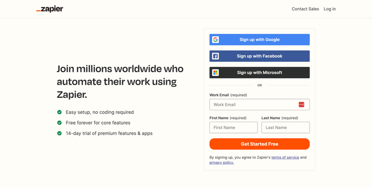
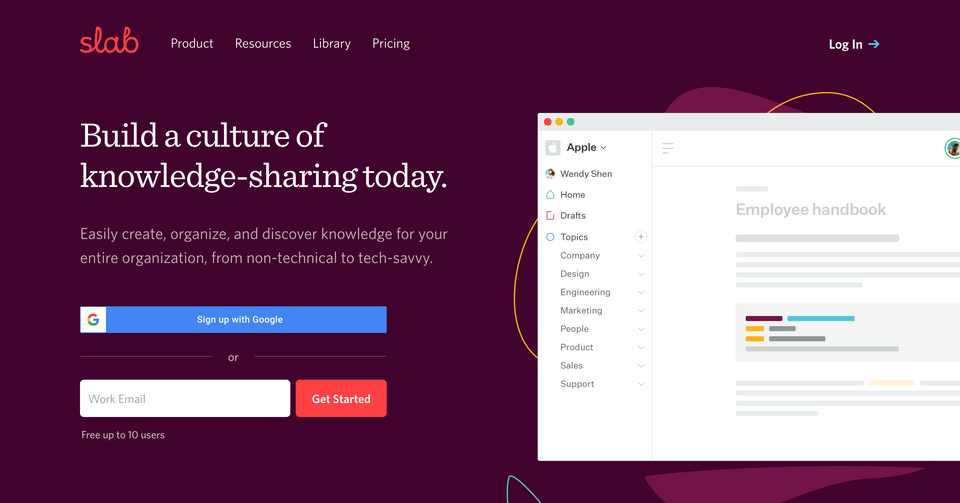
Landing page
- It's a truly beautiful landing page. I can't think of many sites better designed than this giving a fun informal feel for modern day teams but retaining an element of professionalism and trust with their pixel perfect design.
- This design is important because it makes them stand out in a space that can sometimes be quite boring related to documentation and wikis. They want to make the point that their platform makes your documentation look great and engaging too which is a key differentiator
- The main headline on the page is to the point and does a great job of explaining exactly what you'll get from the tool in a single sentence. "Easily create, organize, and discover knowledge for your entire organization, from non-technical to tech-savvy."
- And they don't distract you with too many options, focussing you in on one main call to action just under the main page heading, prompting you to "Get started". Maybe could be a little more descriptive but importantly it's consistent throughout the site
- One subtle thing worth pointing out is that in the navigation, they don't have the common sign up button in the nav when you're at the top of the page.
- Whilst minor, this is clearly a key attention to detail as they are avoiding giving a new user two identical actions to make a decision on which one to use. Whilst only a fraction of a second users will think, are these the same? Which one should I use?
- By removing it when you're at the top of the page, new users focus on the headline and main get started button under the heading whilst existing users returning also just see a login option on it's own, neatly catering for both types of users
- As you scroll down, you'll then see the sign up option appear in a floating navigation. This is very nice attention to detail as it's likely new users will be the only ones scrolling down the page to find out more, so this way they are always keeping a sign up option visible, regardless of where a user is on the page

- Other subtle points worth noting are the option to get started directly using a Google account. There is a good reason for this because it removes a small bit of friction related to having to set and remember a password. You can just get started if you're already logged in to your Google account (quite likely if you're the type of user they're targeting)
- Secondly, if you do just want to enter your email, there is a subtle hint in there that they are focussing on 'businesses' by asking for a work email. This piece of micro copy just reinforces that they are talking specifically to businesses and they want those types of users to realise it catered to them
🖼️
You can always view the onboarding screens page if you want to see all the screenshots I've captured of any specific product in one place.
Sign up form

- If I'm really picky, it seems slightly unnecessary to me to take me to another form at this point to add a few more details. Ideally I'd already be taken into the app as I've made the decision to click the sign up button and already entered my email if I came in via the floating nav option
- Also, another picky point is the inconsistency from the landing page to the sign up form in terms of the Google sign up button. On the landing page it's referred to as "Sign up with Google" but on the sign up form it's referred to as "Sign up with G-Suite". Slightly confusing too because not everyone will know what G-suite is and whether they have it. Again, makes the user think about something they really shouldn't need to
- What they do well here though is very strong social proofing. First a quote from a real customer highlighting the value. You don't even need to read the full quote, you can just see it's someone senior and a reputable company
- Secondly, they back this up by highlighting a handful of well known logos. These things just make visitors feel comfortable they are about to sign up for a well respected and trustworthy service endorsed by others.
Customize your team

- Any concern about a lengthy onboarding process goes away once you enter your name and email. You're taken straight into the web app
- What's clever here is that they create some suspense by giving you a blurred out background of the app. This encourages you to get through the onboarding steps to reveal what's behind!
- The one downside at this point is that there's no indication of progress. There's just a next and previous which can make people feel uncertain and wonder how long they've got to go. If there are too many steps without any indication of how much is left, users are more likely to drop out because of the uncertainty
- You also miss the opportunity to gamify the process a little by giving users little wins and an endorphin hit completing small steps
- You can see with this screen though that they continue to stick with the focus on teams. This tool is clearly for organisations with teams and here you can setup the basics of your workspace
- Another minor gripe would be a better indication of why these things are needed. The randomly generated domain could do with more explanation as this is what will be used by your organisation and so quite an important thing to set
Customize your profile step

- The next step I found a little confusing. I already provided my name at the start. Title and description seem unnecessary at this stage. It's also just not clear exactly what they are for?
- Would benefit from some supporting text to explain what these are and why they might be needed right now. Or just drop them altogether if it's something you can get the user to do later
Invite team mates step


- This seems to be back on track with things I might want to do right now, namely get other team members in to collaborate. This is no doubt important as it is the main purpose behind the product to share knowledge
- There are a couple of nice touches here too. A simple shareable link that you could copy and paste somewhere like slack or MS teams so you don't have to worry about typing in lots of emails
- If you do want to go down the email route, you can also set the role for that batch of users. Nice bit of detail - it's always a bit painful when you have to invite someone with a default permission only to change that as soon as they have access
- Once you've selected a role, you can also input a custom message. Probably not essential but a nice option to clarify to anyone what to expect when this invite comes through
- This is a very common step you see in team based apps offering to invite team members up front. If you can get multiple people in from the same company using the tool early on, you're significantly increasing the chances of it becoming 'sticky' and the team building up some momentum using it. It's also a critical that the entire organisation is sharing knowledge to make this tool valuable
Getting started dashboard

- With basic onboarding steps completed, you finally get to see what was hidden behind the blurred out screen
- You're greeted with a very nicely formatted and designed getting started guide. What's clever here though is that this is also an example for kind of article/content you can create and how nice it looks. A great way for users to learn by doing and be inspired by it
- Rather than continuing some kind of walkthrough wizard, Slabs getting started page is also a document in Slab. Simply reading it will immediately give you a clear indication of functionality but you can also start editing it and trying things out
- They've also created some basic structure for you, setting these getting started docs as favourite and some additional relevant company topics like Engineering to give you a sneak peak of how you can set things up for your company.
- One minor gripe at the end of reading this getting started page is that there's no indication what to do next. It's amazing how uncomfortable users can be about clicking into things on their own initiative. You remove a tiny bit of doubt by nudging a user where to go next each time

- Once you click the home button, you're then taking into the next phase of onboarding which again, using the tool, teaches you about 3 key parts of the platform, Posts, Topics and Search
- This is such a powerful way to teach people how to use a tool as each of these posts walks through each key thing you can do within a section.
- This also means new users are using everything in context and where they will find creating and setting these things up later on. This is in fact an important interaction design principle known as "Recognition rather than recall" A walkthrough wizard can be really powerful to show people around but showing new users things in context increase the chances they will recognise it next time they need to use it rather than seeing a one off screen they only see once during onboarding.
- The example posts they created also demonstrate the type of content you can creating like headings, text, images, gifs, dividers etc. Not only are you learning about what the tool can do but because it's been so nicely designed you're also getting inspiration about how to make it look great for your company too
- Where you can, have first time users set things up in context, learning by doing. It's such a powerful UX pattern because it really cements knowledge and ensures users get up to speed very quickly. It's also much more fun than reading documentation or watching help videos
Final note, onboarding emails

- A few hours after setting up the account, I received this from the co-founder. It's always powerful to see emails come from founders because it really highlights the passion they have about their product and makes users feel great.
- One small improvement here is that there is quite a lot of text trying to highlight a number of key features. It's all quite bunched together too which makes it tricky to scan which is what most people will do.
- It feels like they could instead just focus you on the one thing, i.e just one bullet point like getting your first post created where you can format with 'xyz'. Especially considering the power of learning by doing as soon as they get you into the app
- No doubt they intentionally have this as a basic text formatted email. To the receiver this can feel like it's much more personal and has shown to increase conversion rates. It also avoids various problems you can run into once you insert other types of content like images into emails that can sometimes get blocked or displayed incorrectly by different email providers
Summary and key takeaways
- Where you can use the practice of learning by doing for your SaaS application. Users are far more likely to remember things that they have applied themselves vs reading it in a support doc. Slab does this very well
- Only use steps within the first stages of onboarding that are absolutely essential to get started and ideally progressively disclose more involved things later on. I don't know for sure if name and profile info is essential for some reason but it seem unnecessary in this scenario and something you could ask for later
- Figure out what your aha moment is and tweak your onboarding towards getting the user to do that. Most likely getting users to create their first few posts is going to be the aha moment for Slab and then getting them to format and add certain types of content. The structure they create drives users towards this and I suspect they have quite a high rate of success because of how intuitive it is to create your own and learn by doing
- Try to remove any potential questions users have at every stage of onboarding, no matter how minor. For example, asking for Title and Description related to profile isn't clear what they want a user to enter. In itself it's minor but once a user hits multiple of these, it starts to create some friction
- Experiment with using plain text onboarding emails if you aren't already and have at least one come from the founder. This can be a really powerful way to engage users when they feel like it's personal and the creator of a tool is talking directly to them
TL;DR one pager download of this onboarding coming soon