Onboarding teardown of task management app todoist

Todays teardown is a walkthrough of onboarding of the worlds #1 task management app (as highlighted on their website!) Todoist.
This is a tool I've used myself in the past and have always been impressed with both the design and UX throughout the application. Not only do they do this well on their web app on a desktop but also a seamless experience when switching to one of their native apps. Today we're focussing on onboarding on their web app, so let's jump to it.
TL;DR
Landing page

- Importantly their landing page focuses you towards one sign up route. What I mean by this is that they want to drive everyone towards signing up to with the product as quickly as possible to try things out.
- There's no decision to be made by the user by offering multiple routes such as watch a demo, contact sales OR sign up. Throughout the entire site they simply want you to "Start for free"
- Interestingly this applies both to personal and team/business users. You're driven to sign up regardless of your setup. Later on you'll see how they then tailor onboarding based on your usage. This is a fantastic example of a product led approach where of the product does the heavy lifting in terms of getting users setup and converting them into long term customers
- Above the fold you can see some subtle social proofing with well know logos. This could probably be more prominent as could be easily missed but powerful all the same. Especially when you can bring attention to 300,000+ reviews on the app store!
- The other thing that's nice is that on an average size screen, you see part of a screenshot of the application. Most likely intentional to show enough to catch visitors eyes as a prompt to scroll down to see a little more.
- With one product image you clearly see what you'll get once you sign up and the fact it works on both desktop and mobile devices. And it's a custom made illustration so no danger of any stock images which always devalues a brand in my opinion
- The final thing to draw your attention too is the nice animation further down the page which does an amazing job of highlighting how Todoist caters for all your needs going from basic usage through to advanced usage. They want to give the indication that they've got all bases covered. And they back this up with some social proofing with a quote "Todoist makes it easy to go as simple or complex as you want".
- This no doubt removes any doubt in non technical people that it's easy to use but also for techinical users that it can cater for their power usage too
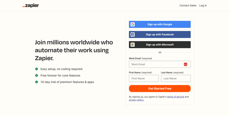
Sign up form

- Once you land on the sign up form, all of the distractions such as main navigation and footer are removed. This is a common practice to maximise conversions on the form removing anything that isn't needed but might be tempting to click on and take visitors away from the page
- To remove friction, they offer a number of common social sign up options including Google, Facebook and Apple. This says a lot about who they are targeting with Apple and Facebook likely to be focussed on consumers and Google potentially more business focussed. This is an important consideration as if they were focussed solely on businesses, it's unlikely a Facebook sign up would make sense here
- These social logins also remove a bit of friction as it means one less password to remember when you sign up. And if you're always logged in to say your Google account, it's going to be really fast to login to the app again in the future
- If you don't want to use your social login, they've still got you covered with a simple email sign up. What's great is that not only do they allow you to set the password up front (it always feels like an extra step when you ask for that later on) but also that they have removed any confirm password input. Studies have long indicated that having a confirm password option actually reduces conversions. Far better to have a 'unmask' password option so a user can visually check it instead.
- Final point on this page is some more subtle social proofing with a quote from a user stating how todos were previously scattered all over the place but now todoist handles everything in one place. This consistently reinforces the inital headline from the landing page that this platform will "organize your work and life"
🖼️
You can always view the onboarding screens page if you want to see all the screenshots I've captured of any specific product in one place.
Onboarding steps - select usage type and experience


- After entering email, we're taking straight to the onboarding steps. Importantly there is no request to confirm my email and risk me getting distracted by something from my inbox. It's straight into getting setup. Great.
- The first step is asking for my usage type. A lot of apps ask for this for marketing purposes and no doubt this is what they are asking for it here too. However, they are also going further than this as you will see later on, these options will actually define how my onboarding and defaults will be configured. Great stuff!
- Choosing personal and then that I'm an intermediate user felt about right. One small gripe with selecting experience is that this is quite a subjective question. What's advanced for me might be intermediate or beginner level for someone else. A little tooltip or supporting text would help to clarify what their definition of beginner, intermediate and productivity pro means.
- The other thing to notice at this stage is the subtle icons to highlight progress and how many steps are left. This is a nice and important touch for a few reasons.
- Firstly, it removes any doubt in my mind about how long this onboarding process will take - it' only 3 steps in total so I'm likely to stick with it.
- Secondly, it's a subtle way to gamify the process. As humans we like to check things off and this gives us the satisfaction of making progress when a step is completed and encouraging us to complete all the steps in the process
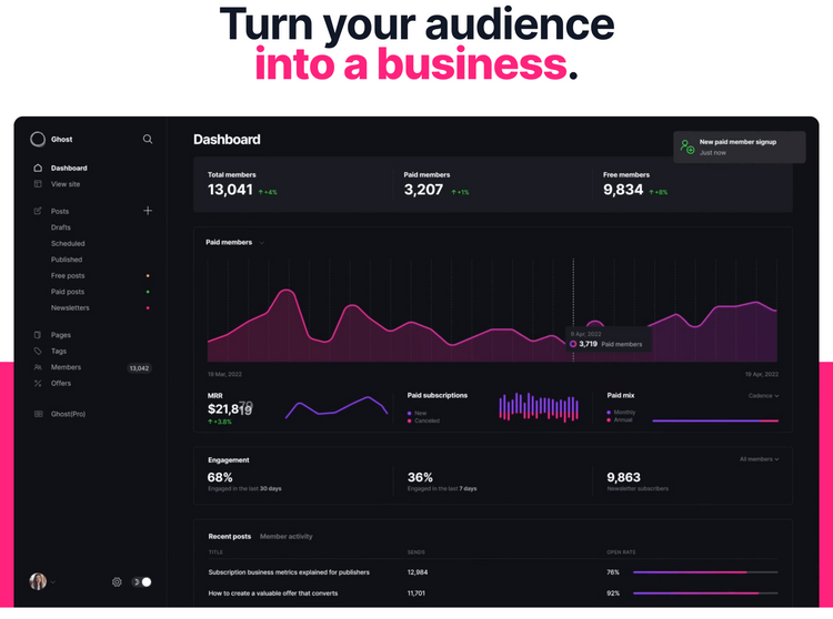
Todoist dashboard

- After completing the onboarding steps I'm into the app within a matter of seconds. In fact it would be handy to perhaps mention that somewhere early on about how quick you get yourself setup. Other apps do this well where they say things like "Get your first todo added in under 19 seconds"
- When you first land on the dashboard it is a little underwhelming which is surprising considering how well designed the website is and the lovely illustrations they have. Feels like they could have carried that over to some parts of the app too
- Anyway, what's clever here is that they have setup my experience based on the questions I answered during onboarding. They know I',m using it for personal usage and so one of my tasks for today is to create all my personal tasks. Very meta!
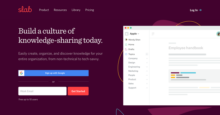
- Similar to Slab onboarding teardown, this is a very powerful practice of getting users to learn by doing. This means they can use the product to demonstrate exactly how things work rather than reading help docs.
- Unfortunately I don't think they take full advantage of this because the other task directs me to an external help page with detailed documentation on how to get started.
- The documentation is great but it's not so good that they are taking me away from the application. This is a potential distraction in the first place and unlikely people will want to consume lengthy manuals when they have just got started.
- It seems to me it would be far better to continue with the 'learn by doing' mantra and queue up a number of todos for each key thing you want a user to learn at this point. That would be really powerful to ensure people complete the tasks (gamify the process) and learn about the product at the same time
- As a task can contain content within its description, this seems like a great opportunity to continue the onboarding in that way. The first 5 todos could be the key things you need to know to get started that are currently contained in the lengthy doc
- Remember the point about not needing to verify my email to get into the app? You'll also see a subtle prompt at the bottom of the screen to verify my email. This is a nice way to handle that verification if you need it because it lets me get a taste of the app before distracting me with something where I have to check my inbox where I could easily get distracted reading another email or clicking into the latest special deal that's just come through!
Todoist upcoming tasks


- Initially that would seem like it's the end of the onboarding prompts. However, they do have future things set up which is really nicely done to demonstrate what else the tool can do and keep if engaged over the next week or so.
- Even if you don't navigate to the upcoming screen yourself, 'tomorrow' you will be prompted that a new tasks is now due. And then later on in the week a few other tasks too.
- This is great because it progressively discloses functionality that todoist offer such as recurring tasks, reminders and due dates as well as how you can group up different tasks
- You'll also most likely notice a 'personal' project has been created where these tasks sit. This example project has been specifically setup on the questions I answered during onboarding, signalling I would be using the tool for exactly that. This then gives me a good indication of how I can group things up and the type of tasks I might want to add
Summary and key takeaways
- Focus on one route towards converting users. For Todoist this is all about getting users to sign up for the product. So no matter where you go on the site they are pushing you towards their 'getting started' button
- Regardless of whether you're trying to convert users by getting in touch with sales or sign up for a product, the important thing is that it's very clear which one you want the majority of users to do. You want to remove anything that means a user has to think about what step you want them to take next.
- A common mistake is offering too many calls to action early on such as book a demo, talk to sales AND sign up which leaves the users with some thinking about what action they should take
- Think about the niche you're focussing on and provide sign up options relevant to them. Don't just provide every social sign up option because it covers all basis, think specifically about the tools your target customers already use.
- Todoist clearly has a strong consumer focus and so includes options such as Facebook & Apple. If they were more business focussed they might have a Microsoft sign up option
- When offering email sign up, avoid having a user go into their inbox to confirm before they can get started. This creates unnecessary friction and increases the chances a user will get distracted by something else in their busy inbox
- Ensure your product is pre-populated with relevant content when users first sign up. Avoid the dreaded blank slate that requires users to create something themselves without knowing what it might do. Even better in Todoists case that you pre-populate based on questions answered early on in the onboarding
- Avoid overloading users by showing too many things to do. Focus on users getting some success completing one or two simple actions and then progressively disclose and evolve the experience over time introducing users to more functionality. Todoist does this by queuing up future tasks and notifications to share more examples of functionality the tool provides