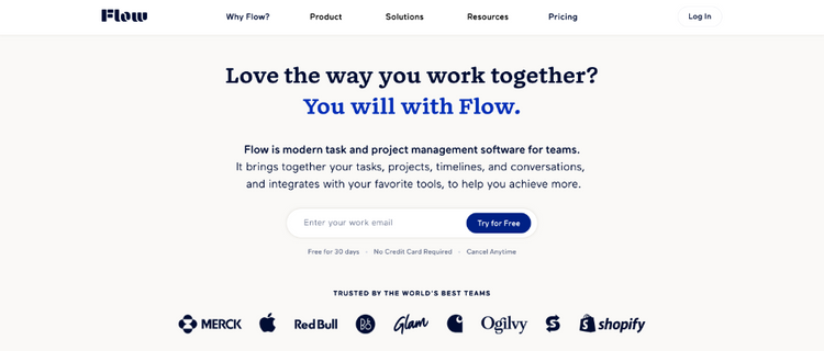
Landing page teardown of AppCues

So today's teardown is for a tool called AppCues, which is essentially an add-on to SaaS products that allows you to build various onboarding workflows, checklists, help sections, popups etc, without having to code it yourself.
The theory behind using a product like this is that your product team can constantly invest in and testing out various ways to improve the onboarding experience without the technical know how or expense of using an engineering team. This means you can learn pretty quickly what flows to implement and work best to help people get setup on on your product.
The focus today is just going to be a teardown of the landing page as I feel there are a number of great lessons to be learned from the way this page has been designed. So lets get into it!
Above the fold

- Starting with above the fold, the first thing that stands out to me is that it’s very clean. There aren't a lot of things trying to grab my attention
- This means it’s easy to spot the two main call outs that are most prominent on the page, Start free in the nav and start building for free under the main heading section
- The only minor gripe for me is that it isn’t clear what starting for free really means, is it a free trial, will I need a credit card, will I get a limited number of days?
- These are all things that just add minor questions into peoples minds. As famously put by Steve Krug, avoid making users think is the no.1 rule
- The value proposition is pretty clear to me here too, i.e product adoption made easy and qualified by the fact it’s focussed on business-to-business
- This heading is vital because it’s probably the only bit people will read fully, as most will switch into skim reading mode after that.
- As they likely know I’m skim reading already at this point, they have made it very easy to digest by splitting out the main benefits into bullet points
- It’s very clear to me from these 3 bullets that this tool wil help me boost activation, increase adoption and increase sitckniess, all vital things for anyone with a saas product
- Now under this we have the main call to action and to be honest if I was already a motivated user looking for this kind of tool, I feel I have more than enough here just to dive in and get started
- Importantly I’m driven towards the self serve route and this makes sense as they claim it’s fast to deploy so I’m expecting to be able to do it myself
- But there is also a more subtle option to get a demo, perhaps if I’m a bigger team or have more complex requirements
- Either way, the important thing here is that it’s clear there is only one primary call to action so they aren’t competing and I’m thinking about which one to pick.
- The only other thing to mention is the media that supports the text above the fold. I can see they are trying to show me examples of how the tool looks on desktop and mobile, which is useful to know but it’s also way too small to actually see what’s going on so really is just filler content.
- It might be better if this was more dynamic and cycled through things full size so I can see rather that trying to fit things all on there together
Below the fold

- If I scroll down a little further, I then see these little usage snippets obviously from customers that have had success with the tool
- The things that’s a bit of a shame is that they are just below the fold and feel like they could fit in above that and I’m using a pretty high resolution screen
- These logos are really powerful and I don’t even really need to read into the examples that much, with the green arrow pointing up and percentages besides them, I can tell that they are positive and that these big brands are clearly seeing a lot of value
- One small gripe would be that the text above these logos is really hard to read! But what it’s saying is really important, 1500+ organisations, that’s very significant and reassuring
- Also, there’s some psychology to the copy, not just any organisations but product-led organisations i.e those that rely heavily on the tool to power marketing, selling and onboarding users which helps to really speak to people with that specific type of product
Build it better with AppCues

- Ok, scrolling down a bit further it looks like I’m in some kind of how it works section
- Or it kind of looks like that but I think it’s actually just further reinforcement of the benefits i.e getting started is easy, you can personalise it and target who you like and it’s really easy to measure
- Personally I’m not sure how useful this is, I think this has already been made clear in the header section
- But a couple of things I do really like about this section are firstly the badges from G2 and Captera.
- People love to see validation from review sites of the quality of a product as it really makes you feel comfortable this is tried and tested and a good quality product
- One thing that would make this even better would be if they combined the review count with this too. This just validates that it’s not just a handful of people that have rated you 4.7/4.8 it’s 255 in the case of G2 for AppCues
- The other thing that’s clever is the testimonial that reinforces how easy it is to get things setup
- There’s then a call to action to “see how easy it is” which jumps you down to the bottom of the page to some kind of how it works section of the steps you take to get started
- Interesting as I didn’t really expect it to jump me down the page. I do wonder if that should be here rather than at the bottom of the page as this section feels a bit unnecessary to me
Product experience is being judged

- As I scroll a little further, I’m taken to this bold statement about my product experience being judged
- That bit I read but to be honest, the text supporting it is just a bit too much to read and I doubt I’m the only one that’s just skipping past this
- This appears though to be more reinforcement about the fact that because my product experience is being judged, I should use a tool like AppCues to guide users to unlock the value of the product faster without having to get lots of technical/engineering support to do it
- OK, I feel like this point has been made several times already so I’m kinda keen to get to the point now where I can find out how
Features & Benefits

- From a number of sections highlighting how easy it is to get started and the top level benefits of the tool it looks like I’m now into the features section of the landing page
- But importantly, AppCues don’t focus on features, they focus on benefits. This is super important because features aren’t what sell your product, benefits are
- I.e The thing you get from using the features is the most important part for customers
- So the first thing AppCues focus on is a benefit, getting users to their "aha moment" faster. This refers to getting users to the point that they ‘get’ the product, they use something that they can immediately see the value in using it
- These sections look very much like they are using some kind of FAB model which basically means combining features, advantages and benefits
- So you can see that they mention some features like checklists and welcome flows, that mean by using these you get the advantage of increasing things like user activation and the benefit is then highlighted with a testimonial that a specific customer has achieved an 16% increase in activation
- These are really nicely structured sections because they focus on advantages and benefits, give you some idea about what features you can achieve that with and then offer a link to a much more detailed case study about it but if that’s too much you can skim through a short testimonial from a real customer who has achieved the benefit they are referring to
- Most SaaS tools make the mistake of focussing on features thinking that’s what people buy but people buy benefits and your features are just the things that power that
- This FAB theme continues for a number of sections highlighting different examples of key advantages of using the tool like increasing activation, increasing usage, improving retention and increasing the quality of feedback coming in
- This is all wrapped up really nicely with some nice supporting graphics that I don’t need to look at in too much detail but can see how they related back to the copy
- And importantly they also look great too which for someone who cares about the design/experience of their product, this is going to be important to them that they are implementing a tool that looks good too
How it works

- After this there’s this nice little banner about mobile. I’m not too sure what this is all about though and feels like a bit of a distraction to the core product
- Plus, when I click it, lots of popups following me around which is a bit annoying
- The key point here is that unless it’s absolutely necessary, I really wouldn’t include it on the home page as you’re potentially distracting people from starting the sign up process and perhaps something to tell people about later
- After this, I’m back to the section I jumped down to earlier on the basics of setting things up
- This is a nice interactive graphic walking through the key steps from installing the JavaScript to run the app, to setting up my first interaction with their drag and drop interface, through to enabling it and reporting on it
- This is nice and easy to follow and kinda makes it’s really clear what to expect in terms of getting things up and running and gives the impression it’s super easy to do.
- The make the complex, simple is a bit marketing speak. I’m not really sure what that means and it’s the kind of thing that almost every tool will claim
- Also the sub text underneath it is really small again and hurts my eyes a bit to read it!
More social proofing & sign up

- Finally part of this page is even more social proofing and evidence of positive results from real customers
- This is a little more detailed than the earlier logo and impact examples but similar format highlighting what they did and the impact it had
- For example, GetResponse implemented a new onboarding flow which resulted in a 60% increase in activation rate! That’s pretty impressive and would easily help get me over the line to sign up
- There’s also a bunch more logos here, these are probably more familiar logos as well so feels like they might have been better off higher up the page. Either way it's very powerful
- Finally, after that there’s the big getting started callout
- This time they do make it very clear what to expect when you get started, i.e 14 day unlimited , no credit card required and that you can basically try everything before buying
- Would be really handy to have this at the top with the main callout in the header too so that I don’t have any question nagging in my mind that might stop me from clicking the button
Conclusion
- This landing page is a fantastic example of how to sprinkle social proofing and evidence of the impact of the product throughout. This is done through logos, testimonials, review site ratings AND links off to case studies
- I love the focus on benefits rather than features. In fact, they hardly mention features throughout, it’s all about the benefits, avantages and value of the tool. This is very important as this is why people buy software, not because of features they’ll get access to but because of the benefits of using those features
- Always remember to clarify what to expect on your get started/sign up buttons i.e is it a trial, how long will it be for, will they need a credit card. This just removes any small amount of doubt from peoples minds
- Only include things that are absolutely essential to the core offering. Don’t offer people too many opportunities to disappear off deeper into other parts of the site where they might get distracted
- When using supporting graphics and images, make sure it’s really easy for people to see exactly what’s going on.
- Keep your landing page clean and focussed so there aren’t lots of things trying to grab people's attention. AppCues does this really well throughout and only ever pushes you towards one or two actions