Onboarding teardown of Milanote, the creative project organising tool
Today's onboarding teardown is Milanote, the tool for organising creative projects. I'll be going through some analysis of the landing page and some of the cool things they're doing there that will help with conversion. And then we'll dig into the a walkthrough of getting setup in the tool for the first time.
TL;DR
For those short on time, these slides are a shorter overview of some of the key points from my analysis of the landing page and onboarding.
Landing page
- Beautifully designed landing page which really highlights the visual aspects of the tool that targets creative and differentiates them from other similar tools on the market
- One thing to note is that they are heavily product-led which is that the product is front and center in doing the heavy lifting converting users. i.e you don't see any sales or demos calls to action, it's all about getting you into the product to try things out
- This approach means that the landing page is very lean, they remove all distractions to keep you focussed on the main call to action which is "Sign up for free"
- Because of the clean and lean design these sign up buttons have great contrast too without being overwhelming
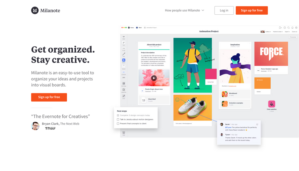
- They've also done a fantastic job of fitting in all the key things you probably need to know about, above the fold. Simple and clear heading highlighting exactly what the tool offers.
- Followed by some subtle social proofing to build trust, cleverly likening the tool to a very well known tool in the space with validation of its visual differentiator.
- Then finally complimented with a fantastic graphic which gives you a very clear snapshot of what you'll get once you sign up. The thing I love about this graphic is it's an illustration specifically created for this product i.e not a stock image! I always wince a little when SaaS companies use stock images because they are generic and can sometimes devalue a brand a little
- In particular this graphic highlights the visual nature of the tool and creates some inspiration to get your hands on the product and start adding in content
- For those who need a bit more convincing, the only additional navigation option provides a whole bunch of use case examples from various creative fields. Clicking into one of those provides a focussed deep dive of that particular disinclines needs and how the tool provides value.
Sign up form

- Once you click to sign up, you're then taken to a form which defaults to signing up via email, asking for a few specific details such as your name, email and a password
- The design and structure of this page looks great but considering how lean and focussed the landing page is, it's a little surprising to find this page a little cluttered.
- The key point here is that if you've already convinced users to get to the sign up form, you want to remove as many distractions as possible to ensure they aren't tempted to click away.
- There are a few things here I think will potentially cause that. Firstly, the 'how people use Milanote' navigation option. This potentially gives people a reason to click around and leave the sign up form when you had already done enough to get them here in the first place
- Instead of providing links for use case examples, I'd be tempted to use some simple social proofing alongside the form instead, such as a usage quote from a specific user type. This would still reassure users that their potential 'creative' use case is covered without the risk of them clicking away from the form.
- Secondly, the footer is loaded up with lots of links to catch your eye. Whilst no doubt great content, this might encourage people to click away, get distracted and end up not signing up
- It also seems unnecessary to me to include all these footer links and would perhaps be better to go with a simplified footer with only the essentials to again focus the attention on the form itself
- Final points are related to the structure of the form itself. By asking for all these fields up front like name, email & password, it makes it feel like there is quite a bit to fill in when it probably isn't essential at this stage. i.e Could they just ask for email and password and get my name once I'm in?
- I'd also want to test making sign up via social options like Google and Apple the most prominent. The email sign up option could then be another button below these.
- The potential benefit of this is that getting users to onboard this way means you can capture their name automatically as part of that social sign up and they wouldn't be required to remember yet another password which reduces some friction and one less thing to forget
- Other minor point is some inconsistencies in using "submit" as the button text which is very generic vs Sign up with Google/Apple. This should be more consistent with the other sign up options so it's clearer that you're signing up at this point rather than just submitting something.
- On the plus side, after "submitting" my details, I'm taken straight into the app without any prompt to verify my email first. This is important as can also often lead people to other distractions in their inbox like that latest special deal that just came through from Amazon!
Onboarding questions


- Once you you complete the form, you're presented with two questions asking about you and your usage.
- One neat thing I've seen a few web apps doing is showing this kind of form overlaying a blurred or semi transparent view of the app, in this case the dashboard. This creates a bit of excitement and urgency that you're almost in the app and just complete these few steps for the big reveal to see what's behind. Exciting!
- Back to the questions, sometimes these kinds of questions can be really powerful, benefiting you as the user in terms of the way a tool is setup using answers to these questions and the business itself in terms of how they serve and communicate with you going forwards when they can target more specifically
- In this case it looks like these are more for marketing use and unfortunately the questions themselves are a little confusing. If they aren't essential, I'd be tempted to ask them later to remove a small bit of friction getting users into the app to play around
- The other point is that for both of these steps, the question is the same and the options are very similar which is quite confusing in terms of copy used. Could be much clearer removing any ambiguity and ensuring users actually answer accurately
- On the plus side, this process is very short and they confirm that by signally there are only two steps with a progress indicator which keeps impatient users motivated to finish and that there's no uncertainty about how much is left to do.
In-app dashboard walkthrough


- Despite the lovely visuals and creative design on the landing page and sign up form, once you land on the dashboard it all feels a bit underwhelming and grey
- This is quite a big disconnect vs what I was expecting to see and had experienced up until this point
- Instead you are a shown a blank, grey page highlighting one specific section to kick off the in-app onboarding wizard
- On the plus side, you're being shown in context the steps to take to get all the basics up and running. This means you're very likely to remember where they are and you're learning by taking the same actions you'll do when you're 'on your own'
- The downside though is that because this is all quite underwhelming and not the creative experience I was expecting. It feels like it's dented my admiration for the creative side of this tool a little which will take some time to build up again
- First step is to create a board and once I do that, I then see the kind of thing I was hoping to happen as default which is a bunch of pre-built templates based on common use cases. These are really nice and do a lovely job of highlight all the visual parts of the tool I was imagining.
- The one snag here is that the default is still an empty board. And most people will stick with the defaults. Would be far better to default to one of the lovely pre-built templates that shows off all the bells and whistles rather than someone starting from scratch and having to find all this cool stuff themselves.
Content in-app walkthrough

- Once you've selected your template, you then get the in-app walkthrough for every piece of content available
- The good thing about this is that it's all in context and each one has a short explanation about how it can be used. Some have a nice touch of some extra tips of what you can do with them
- The downside though again is that each one is created without any content. At the onboarding stage users like to see examples that will provide inspiration and they don't have to pre-populate with their own content which adds friction. This problem goes away also if the template selection at the start defaults to one of the snazzy pre-populated common uses cases
- The other opportunity they miss out on here is that they could pre-populate these content blocks with other things that users can do to get them to engage further with the tool. So for a todo content block, it could be pre-populated with "Add a reminder", "Create a todo for your project" etc. That way they engage with specific functionality rather than having to be creative and come up with it themselves
Summary and key takeaways
- Ensure you're consistent with your calls to action and who you're targeting throughout onboarding. In the most part, Milanote do a fantastic job of highlighting the creative niche they are focussed on and keep reminding you of that through both their design and onboarding
- Focus on one route or two maximum in order to convert your users. For Milanote they exclusively focus you on sign up to the product, with a product-led approach to converting users. Everywhere you go they use the same call to action to sign up which ensures there isn't any uncertain about what those buttons will do
- Once you've driven users to a sign up form, remove as many of the distractions that aren't critical to completing the process. Whilst well designed, Milanotes sign up form has a lot of distractions that potentially encourage users to click away from their form and fail to convert them.
- Where you can, pre-populate dashboards and content with examples of what users can expect to give them an idea of what's possible. Whilst it can sometimes make sense to allow users to enter their own content, it adds a big cognitive loads for some users to be creative and figure that out for themselves.
- Only ask what's absolutely critical for a user to get started and then progressively ask for more things a user has some wins under their belt using the product. Users generally don't like committing too much information before they've built up some trust with a tool so asking for things that aren't critical might add friction
- Where you can, use the product itself in context to guide users to learn more about what it can do. Milanote does a fantastic job of this with it's template examples but unfortunately doesn't make those default or already populated so they can be missed.
🖼️
You can always view the onboarding screens page if you want to see all the screenshots I've captured of any specific product in one place.