Onboarding teardown of Ghost - the all in one platform for creators
This weeks onboarding teardown is very meta as it's a teardown of ghost.org which is the very platform I use to write these articles every week! It had to be done though as it's an outstanding platform with incredibly slick onboarding which everyone can learn a lot from. So let's get to it!
Landing page

- The headline here makes the value prop very clear. Literally if you've got an audience or want to build one up, Ghost is the tool that can help you turn your audience into a business.
- There's isn't a super obvious call to action immediately associated with this though which is a little surprising. There is one in the top menu though at least
- I'm a little distracted by the Just launched Ghost 5.0 button too. Especially considering it links to a post from May last year so I'm not sure just launched makes sense now.
- Also seems to be distracting me from signing up and probably much more relevant for existing users where they would experience a big jump in functionality
- Showing just enough above the fold is a preview of the product that's done in a way that entices me to scroll down and see more. Interesting too as very different to Crazyegg landing page teardown where they literally stopped you from scrolling down the page. Ghost clearly want you to scroll to find out a bit more
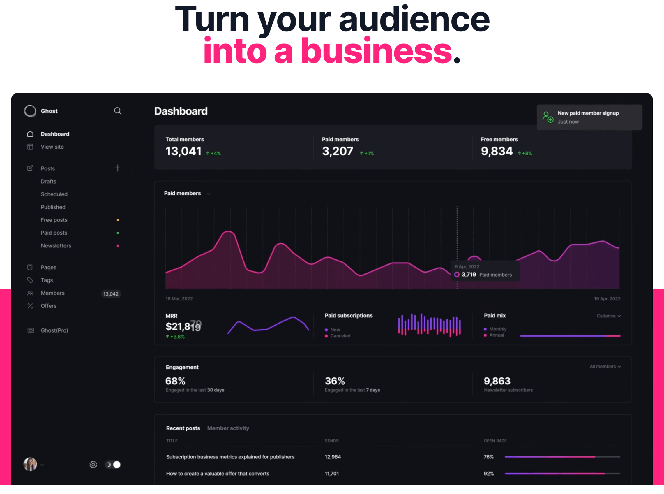
- The product preview is in fact a little animation of the main Ghost dashboard which reinforces the theme from the main heading. You can see member numbers increasing and importantly recurring money you could be making from your members
- This is smart because it's not showing you specific features but the value prop and benefit of the tool. i.e this could be you with all these thousands of members paying subscriptions.
- Scroll a little further, you then get the expanded version of what the tool is how you can use it and the key jobs that it will take care of for you. You also get a very clear call to action to start a trial and that you'll get 14 days totally free
- This is very clear but makes me wonder some or all of this explanation should have been further up the page. If I'm brand new to this product, there wasn't enough from just the headline and above the fold alone to convince me this could tackle my pain points
- Scrolling a little more, you do start to get a feel for the power of the tool, particularly how well it's designed and the options out of the box to get started that will just make you look great.
- There's some really smart copy used in this section too, "Don't settle for another basic profile that just looks like everyone else". Continues the theme around how you can customise the tool to your own personal needs and stand out from the rest
💡
Key takeaway: Focus on value and benefits rather than features. Users don't buy products to get access to lots of nice features, they buy it to do a job
Getting started - Choose a style to start

- I love how Ghost start the process of signing up. No boring email and password form to fill in. They take you straight into the creative process where you select what your site is going to look like from their available themes
- This is a great way to start onboarding because it gets users engaged immediately visualising something that is value to them instead of having to fill out a bunch of standard forms
- Minor gripe is that once you land here there's no indication of how long is left. Users love to see progress bars or feedback on how far they've got to go because if it's clear it won't take long, they're much more likely to see it through
- Other nice touches include is the reassurance that you can change these choices later. This just ensures people don't overthink this but also removes any question of doubt, "Will I be able to update this later" so users just don't have to think.

- For each theme option you can also click to see a full size preview on both desktop and mobile. This is great to visualise how it will look on both devices and again shows off how nice most of these designs look straight out of the box
💡
Key takeaway: Don't make users think! Remove any areas where users might have doubt such as whether they can change something again later or equally if it will be set in stone!
Ghost site details

- Once you've chosen your theme, time to enter some basic details
- Still no indication of how far I've got left but also whether both of these fields are required or not?
- I'd be tempted to drop the publication description. This might just be a bit more than users can be bothered to fill in and probably won't impact the initial setup that much
- Main thing here though is that the number of fields I have to fill in are kept to a minimum. So there's nothing to overload me here or a requirement to fill in things that would take a load of time
💡
Key takeaway: Only include fields that are absolutely essential or will significantly enhance the experience a user will get from providing it
What best describes you onboarding step

- Next up its time for me to share some details about who I am and what my intentions are
- This is a nice way of doing it because it's visual and only a few options to select so very easy to do. Much better than having to scroll through a long list of options in a drop down
- This is becoming more common and is a great onboarding experience where products ask about your intended use not only for their benefit to know more about you but also to personalise the experience
- This means you'll see the things most relevant to your usage and experience so avoid seeing things that might be too simplistic or too advanced. Nicely done!
- The only slight hesitation on this page was that I wanted to select publisher but I'm definitely not a journalist or professional writer! So I selected creator but that didn't feel quite right either.
- This was a bit of a stumbling block because I felt like the option I needed wasn't there and the only alternative was to skip which I didn't want to do either. Feels like this could leave a few users unnecessarily questioning what should be a very simple step
💡
Key takeaway: Really think about the copy you use for your buttons and what it is the button will do. Better to use action packed copy like 'Start creating your site' than a generic 'continue' or 'next'
Sign up form & credit card details

- Only at step 4/5 of the onboarding do you actually see what most SaaS apps will show you on the first step - the standard email and password sign up form!
- Super clean with no distractions or links to tempt me away. Ensures I'm focussed on filling out the fields. Clear accompanying copy to tell me exactly what I'll get when creating my account. i.e free 14 day trial of everything
- A lot of tools these days go overboard on the password complexity which can trip a lot of people up. Ghost makes it clear what's required. and keeps it simple.
- Always good to show up front what's needed in terms of any password rules as nothing more frustrating than attempting the password and then only at that point to be told the password rules in an 'error' making the user feel like they've done something wrong!
- Seeing the same continue button here reminded me that's it's a bit of a shame the copy on the button is so generic. Feels like more could be done to spice this up. Also still no indication of how long is left and it's starting to feel like quite a few steps now?

- Next up Ghost hit me me with a credit card requirement! Notice they don't call it billing details or enter your payment details but rather 'verify your card details'.
- This, I believe, is because that genuinely is all they are using it for, to avoid spam rather than charge your card. They confirm this with the additional copy below the title.
- Makes sense to provide more context in this scenario because it feels like asking for my credit card at this stage might put people off seeing all the cool stuff the tool can do
- Well they go the extra mile and provide me with a really nice detailed explainer highlighting exactly why they need it.

- Sounds crazy but this is one of my favourite parts of this onboarding because the copy is so well written it removes any doubt I had about whether I should bother entering my card. It also continues to build more trust in the tool at such an early stage in the process rather than going for the hard sell
- I love this explainer and I love the button copy too because it basically gets you as the user to self confirm that yes, this is in fact pretty reasonable and really cement that in your mind. I feel a bit like this was some kind of subliminal messaging that I'm know convinced to enter my card details!
- Other bonus points for the simplicity and design of the form that just feels so easy to complete and flows in the order that makes sense to look up the details on your card.
- If I had to find a minor gripe it's that anyone who doesn't know the tool and fully trust it yet, there's not much on this page to reassure users how secure it is. This usually comes in the form of badges or who it's powered by, such as Stripe, to highlight to a user they're in safe hands and has shown to significantly increase conversion rates
- You can also offer contact options or chat at this stage for instant answers to any questions from customers that have any concerns which helps to build trust through transparency
- Importantly, Ghost also don't include this step until the near the end of the initial onboarding. This is smart because they know I've spent some time setting up the basics, they've teased me with previews of what my site will look like and I've personalised it a little bit.
- I now want to get my hands on the site and continue playing with it and this initial investment and personalisation helps offset the friction of a sensitive stage like this.
- My hunch is that had the credit card step been at the start of the onboarding journey, they'd no doubt have a much higher drop off rate for it
- Definitely worth highlighting the generic 'Continue' copy on the button again at this point though. This is the 3rd 'Continue' in a row and I'm still not sure how much longer I've got left to go and that isn't providing any guidance either
- Knowing this is the final step before the big reveal the first version of my site, this could perhaps be something a bit more exciting like "Verify and lets get creating!"
💡
Key takeaway: To maximise conversions on more involved steps or sensitive steps, it's usually better to place them after the point at which as user has already spent some time on the fun stuff and even personalised things so they feel a sense of investment in time that they won't want to give up
Onboarding completed - All done!

- OK, this is nice. I've completed some steps and ghost has kindly whittled down to 4 key areas that I can now dig into. And is showing me a nice preview of exactly what I've just created
- This provides nice feedback about what I have an importantly allows me to visualise the things I will want to go and look to configure
- The only problem is they aren't giving me any hints at to which one I should do first or any order that's best to do them in.
- This means I have to make the decision all by myself which perhaps might not be the thing that really makes the product stick and retains me.
- It would be nice if this section was gamified too. i.e These were like todos or similar that were checked off once I completed them to encourage me to actually do it
- Customising the site seemed like a good one to pick first because I'd only touched the surface in terms of design and setup so I head over there first.

- Surprisingly, once I navigate to this section the "What do you want to do first" steps are no longer visible anywhere. And even going back to the dashboard, I can't find them there either
- This is a shame because it seems like those were the 4 most important things Ghost wanted me to do but now I can't remember all of them so I'll have to go solo from here
- This seems like a missed opportunity to me to help users get some essential parts setup that will keep the momentum going on all my progress so far

- The dashboard is worth a mention for the lovely example of how to show a 'blank slate', pre-populated with example data where a user won't have any yet.
- Ghost gives me a lovely visual of what will eventually appear here, slightly blurred out with dummy data so I subtly know it's not my data.
- It's also prompting me to import my audience list. Clever because no doubt they know if they get their hands on that I'm very likely to stick around for some time
- After that, you see some examples of existing successful blogs/newsletters that provides inspiration to those just getting started. It's a great way to show those who might not have an audience/content yet what they can potentially achieve
- Unfortunately, one thing that was disappointing here is recent posts. Previously when I signed up to start the uxthatconverts.com site, this was pre-populated with 7-8 deep dive posts that shared some really useful information about how Ghost works and what you can do with it
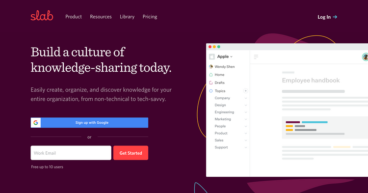
- This was a great way of helping me to 'learn by doing' because I got inspiration on the different ways I could structure things as well as various features I could utilise that might have taken me a lot longer to find. This was very similar to what I saw on Slabs onboarding too, very strong on the learn by doing approach.
- Not sure why it's not showing for me though. Maybe I selected a different usage option or they've taken it away for some reason
Billing and cancelling account

- Final thing to mention is how nicely upgrading & billing is handled within ghost. Firstly, they don't automatically enrol you on any plan that will automatically start billing you if you don't cancel during your trial period.
- They go for an opt in approach instead which is a really nice way to build trust. Far too many brands (usually the big corps) are the opposite of this hoping you'll miss the cancellation window and have to pay anyway even if you've not really used it
- The billing details are super clean, really simple to understand where it's immediately obvious any savings you're making and exactly what you'll be billed 'today' should you go ahead
💡
Key takeaway: Billing transparency and simplicity goes a long way in terms of building trust with users. Don't bill them unless they expect it and be totally upfront about exactly when it will be and for how much

- And just as gracefully Ghost make it super easy to cancel and delete your account too
- It's refreshing not to have to jump through a whole bunch of hoops and counter offers in an attempt to retain me.
- Ghost also implement best practice to ensure I can't ever casually or accidentally delete my account without knowing about the consequences. Using a set of toggles, I have to enable each one to confirm I understand before the 'big red button' will let me click
- A lovely onboarding experience all round, even to the point of deleting my account!
Summary and key onboarding takeaways
- If you're going to ask for a credit card before users can use the product, better to ask for it once the user has invested time and has started some personalisation.
- Also, if you're offering a free trial, transparency on why you're asking for it and that users won't be charged at this stage will go a long way
- Ensure that you provide a clear indication to users about how long or how many steps left in the onboarding process. This helps to keep people motivated and when done well can also mask longer onboarding sequences
- Avoid showing totally blank dashboard or account screens for brand new users. Take a leaf out of Ghosts book and show some nice example data so users can visualise what will eventually be there
- Even for things that might seem obvious, like being able to edit somethign later on, always better if you can reassure users that they can change things so they don't get too bogged down overthinking something, especially early on in onboarding
- When giving users multiple options to choose from, always good to signal which one you recommend they do first, especially if it ties back to getting them to the aha moment
- Really think about the copy of buttons and exactly what clicking on it will do. This can be really helpful for users to. know what will happen next and create some excitement rather than using generic button copy like continue or next.