Onboarding teardown of Crazyegg
A walkthrough of the landing page and onboarding on Crazyegg, the popular website analytics tool.

This week I wanted to do an onboarding teardown of a very well known and long established website analytics tool, Crazyegg. I was drawn to this not least because this tool has been around since 2005 and so has gone through many iterations. But also because I noticed a couple of very interesting tactics they're using to draw users in and convert them. More on that shortly, so let's get to it!
Landing page
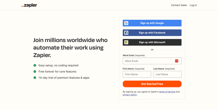
- One significant thing that stands out to me on this landing page is that you are locked into the above the fold section. Unless you explicitly click the "Not ready to get started?" link under the sign up option you can't scroll anywhere on the page
- Normally I'd say this is bad practice as is highly unexpected for anyone who has navigated a website before. However, in this case (and no doubt they've tested it!) it's an incredibly powerful way to convert users because it removes so many potential distractions when it's already very clear what users will get just from the content above the fold
- This also no doubt works for Crazyegg because the sign up prompt and main call to action is compelling enough that I might get my hands on insights to my own website so quickly, with the show me my heatmap copy.
- The main page heading is bold and clearly highlights exactly what value you get from the tool. "Make your website better. Instantly." This is exciting and makes you want to start the process to see exactly how it will do that.
- Their main call to action is compelling too with a number of important best practices in place. They have two very strong examples of social proofing in place highlighting that 300,000 sites use crazyegg, followed by a handful of very well known logos.
- Social proofing is important because people love to follow what others are doing it's what they are most comfortable with rather than having to make the decision solely by themselves
- They also use powerful button copy that describes exactly what you're going to get by starting the sign up process. Instead of the generic "Sign up" or "Create account" they use "Show me my heatmap", this is super clear and intrigues users to get started
- The only weak part of the page so far for me are the 6 examples on the right with small illustrations highlighting the key features of the tool. Whilst you certainly wouldn't want lots of content in here, this is too thin for me to really serve any real purpose.
- When you display features to visitors, they then have to work out how those features can be used. What they really need to know about are the value and benefits. E.g Heatmaps - see where your users really click.
- Once you do click the Not ready to get started link? you unlock a more traditional SaaS landing page, with feature blocks highlighting the key functionality and benefits followed by secondary sign up actions driving you towards signing up to analyze your website.
💡
Key takeaway: Social proofing is a critical part of converting users not least because of something called the bandwagon effect. That is, people are more likely to engage in something if other people are already doing it successfully.
Sign up form

- After enticing me to enter my website URL and the excitement of seeing a heatmap of it soon after, this next step was a little underwhelming
- Instead I'm taken into the standard sign up flow and it almost feels like I'm starting the sign up process again.
- At this point, so many people will expect to see something related to the website address they just entered.
- I also see it as a missed opportunity to really build some momentum by showing users a preview or example that pulls the website they entered. This would have been so powerful to give users a real incentive to complete all the onboarding steps.
- From a UX perspective the other important point here is some feedback to at least highlight they have captured my website address, even if they aren't going to use it right now.
- As mentioned above, this could be part of the title or supporting copy just to say hang tight, we're 60 seconds away from creating a heatmap for that website address you just entered.
- Aside from that, more best practice at play here to maximise conversions. They further reduce down options to navigate away from the page with only minimal and essential links in the main navigation menu
- They've also kept my sign up options to a minimum with only Email and Google being options. Minor gripe I have with these is that they are both prominent buttons and so are competing for your attention as it isn't clear which is primary.
- And finally, more powerful social proofing really driving home the value of the tool and validating the headline from the home page by highlighting how quickly a user was able to identify and implement a change that doubled their conversion rate
💡
Key takeaway: Increase completion rates by hiding away unnecessary navigation options from key pages like sign up forms and checkout flows. Ask yourself whether it's essential any links you're currently showing and remove if not.
Choose your plan

- Next up we have the pricing page. Lots to unpack here but first subtle thing I spot is a progress indicator. Whilst subtle, this is always good to include because it gives people a clear indication of progress and will motivate them to keep going
- You'll notice that whilst the first step didn't have the progress indicator the one that has appeared here shows I've already completed a step. This is clever because it makes users feel good, like they're on a role and already making progress.
- This is important because of something called the Goal-gradient effect which essentially means that the closer someone gets to a reward, i.e getting their heatmap, the more they speed up their behaviour to get there. This kind of 'fake' progress I mentioned above and showing how long is left, subtly creates the behaviour changes like this
- One gripe I do have is the amount of information and options you're presented with as a user. This is just too much to scan and make an informed decision on without really reading all the details which the majority of users simply won't do
- As you get a 30 day free trial on all plans, it would be tempting to just pre-select the 'plus' plan for users and skip this step entirely as can always be changed later and better to get people seeing value from the tool asap.
- A couple of other minor things that are a nice touch are the G2 badges which provide authenticity that this is a well established and well respected product. Whilst very subtle, you'll also notice they have a "fastest implementation" badge which continues the theme of how quickly it is to get going
💡
Key takeaway: To convert users on pricing pages, the no.1 rule is to keep it simple! If users can't work out your pricing at a scan, they'll likely have unanswered questions they'll need to figure out before they proceed which might create enough friction from them to walk away.
Billing information

- The 3rd step of onboarding is billing information. The main thing that is clear on this page is that they continue to reinforce that it's a 'risk free' trial and you get 30 days free before you pay anything. 'Risk free' is an odd use of copy for me here but that's clearly subjective
- This is important though because no doubt this page will see a high drop off where people just aren't comfortable providing their credit card until they've got into the product and see some value
- There's lots of research around the pros and cons of asking for a credit card up front as part of the onboarding process. If you are asking for a card, the one thing you should always do is be explicit as to why a credit card might be required. In this case, it's covered as part of the FAQs which could easily be missed and isn't super compelling
- There's a further snippet of social proofing here continuing the theme around how easy/fast it is with a quote about how easy it is to start
- This is followed by a bunch more well known brand logos. These very well known brand names are key to show here because it helps to build trust at a stage when someone is entering sensitive information such as credit card details.
- If I'm really picky, the way they've displayed what I'll pay today and then at the end of the trial is quite confusing. At a glance this looks like I'll pay $29 at the end of my trial and then billed $348 annually. In fact, I'm pretty sure I'll just pay the latter as they are all annual plans.
- These kinds of details are important because any confusion at this sensitive stage raises questions that might cause enough friction for someone to just walk away
- One other issue I do see at this stage is no obvious way to get in touch should I run into a problem. Users often run into unexpected card issues, so some form of chat or FAQs can often solve simple issues that might otherwise cause frustration
💡
Key takeaway: Users often get stuck on billing pages for things outside of their control, like a bank simply not processing a payment for a specific company. Best to have an option to get in touch so that you can guide users through to completion when they might otherwise walk away
Install tracking script

- The final stage of onboarding is to install the tracking script to the website I want to monitor
- This is an interesting dilemma because there's no getting away from the fact that there is a technical element to installing this that not everyone who runs a website will be 100% comfortable with
- Crazyegg do well to avoid some of the technical challenges by detecting if a certain domain already has Google Tag manager installed on their site. This means that they can avoid a user having to copy code on to the site and just connect up via Google instead
- Because they know this is the least technical route, this option also has the most prominence and has the only call to action button on the page
- If you don't want to go down that route, there is still a DIY option which takes you to a section listing the most common website builders with easy to follow instructions
- If you're not comfortable at all, they also offer a route to pass on this step to a developer or technical team mate. Whilst it might seem obvious for someone to do that, this just removes any doubt and an easy way to send on the technical details for a colleague to work with instead
- A couple of small improvements come to mind for this step. Firstly, I would make it a bit clearer why this step is so critical. As it requires a bit more work from the user, you want to be clear why its essential first step before the tool can be used. You could perhaps also provide a very short video to explain it in simple terms as no doubt some people will find this part too much friction
- The other thing you can do for more technical stages like this where it requires a little more involvement from a user is to incentivise it. The most obvious way to do that here would again to perhaps show a preview of your site and the fact you're so close to unlocking that heatmap and all the insights it's going to give you. This will encourage people to spend a bit more time to get it done
- The final thing that was a little underwhelming was the fact that once I had installed the script, the success feedback message was so subtle it almost wasn't clear it was completed. It also feels like an opportunity for something much more exciting like your website suddenly being revealed or at least something more visually appealing to highlight that it was successful and make the user feel good about completing it.
💡
Key takeaway: For onboarding steps that require a little more involvement from a user, it can be powerful to incentivise it so that a user can clearly see the reward of completing a specific step where there might be some friction you simply can't avoid.
Dashboard

- After completing the onboarding setup steps, I'm finally taken to the dashboard. Unfortunately this is all quite underwhelming as doesn't really give me any indication of all the great insights I'm going to be able to get yet
- The other problem I see at this point is that the main reason I started the sign up flow was because of the promise of seeing a heatmap of my website but there is no mention of 'heatmaps' anywhere on the page
- This means I have a question in my mind about what a snapshot is and whether that's going to give me my heatmap. Seeing as heatmap of my website was the main callout at the start of the process. It would have made sense to focus me on completing steps related specifically to that as the no.1 thing to do
- I'm also quite distracted by a number of menu items that simply don't seem that relevant to me as a brand new user. For example, I won't have any traffic or errors to look at because I'm a brand new user without any activity. There is also a big upgrade button taking my attention away from the main call to action on the dashboard to create my first snapshot.
- Whilst some people might know they already want to upgrade, the vast majority just won't need to see the upgrade option right now. The other benefit to showing upgrade later on is that it means it will be more impactful a few days later when a user is now hooked on the insights they've gained. If it's been sitting there for a few days, I'm more likely to ignore it as it won't be anything new.

- I followed the steps to create a snapshot and eventually see this leads me to starting the process of generating a heatmap of my site.
- This is the point I'd love to have seen been much more focussed once I'd reached the dashboard. I could have easily been distracted clicking around on other things and given up before I'd even seen a heatmap.
- Once I've got the heatmap, that's the point Crazyegg could then start to offer me more things to look at, as per the callout you see about the snapshots list for "Create your first survey".
💡
Key takeaway: It's always good to pre-populate blank slates like dashboards where a user is brand new and hasn't got any data to work with yet. A pre-populated blank slate can help someone visually see what will go here eventually or even be populated with content that shows a user how they can use the product as shown in the todoist and slab teardowns
Summary and key takeaways
- Social proofing is one of the most powerful ways to convert users. There are many reasons for this but one is because of something called the bandwagon effect. This simply means people are more likely to follow something others have already done and had success with.
- For more involved or technical parts of an onboarding process that are critical to the setup, you really need to make it super clear to a user why it's required and incentivise it to increase the chances of a user completing the step
- The other important point for a more involved step in the onboarding process is to try to place it later on in your onboarding steps. The reason for this is because at this point a user has already invested some time in setting things up and so they will be more prepared to continue because they've already got so far.
- Try to get users to the aha moment and the reason they signed up as quickly as possible to realise value. For Crazyegg this was all about getting me to see my first heatmap of my site at which point I immediately would have seen some insights within the first 10mins or so of using the product
- Provide progress updates to users through progress bars and feedback to help with the Goal-gradient effect. This effectively means that the closer users feel like they are getting to a goal, the faster they speed up their behaviour to get there.
- When users reach forms you want them to complete during onboarding, you should think carefully about any links you're providing that would distract them and take them away from that process. With Crazyegg, as soon as you start the sign up process they remove all of the secondary navigation to ensure you're focussed on only filling out the forms they need you to
- When placing calls to actions on a page i.e buttons or links, keep the options down to two at most and ensure one of them is clearly the primary action you want them to take. For example, for sign up options you might want Google to be the most prominent and recommended sign up route, therefore a big button but have email sign up as a secondary option that is just a text link alongside.
🖼️
You can always view the onboarding screens page if you want to see all the screenshots I've captured of any specific product in one place.
TL;DR
Currently working on the one pager/sliders for this so check back shortly!