Maximise conversions by having a laser focus on your niche
This weeks teardown focusses on ConvertKit which is an extremely interesting SaaS company to study. Not least because it was built by Nathan Barry in 'public' as part of a "Web App Challenge" to try and get from $0 to $5,000 MRR in 6 months. The results today are that ConvertKit has reached $30mil+ ARR! They even happily share their revenue numbers for everyone to see here!
When a company has been this successful, it's a great candidate to dig into exactly what it is they're doing that seems to be working so well. Today we're going to look at their website landing page which is a beautifully simple lesson on how powerful focussing on your niche can be.
Keeping you focussed with minimal distractions on the landing page

- The first thing is how remarkably simple this landing page is. It really drives home the classic mantra of "less is more". And remember this is a $30mil+ a year company
- With the navigation only having 4 items, there are no distractions ensuring that you're focussed on just a few important sections
- Firstly the dynamic heading which rotates through a handful of common use cases that their marketing hub is built for
- This focus on just a handful of user types is powerful because it means they can speak exclusively to a very specific niche and exclusively highlight the proposition to that niche
- It also ensures that they come across as the experts in that space
- This would be much harder to achieve if you they were pitching to say "Small business". This means every piece of copy, every image would have to be much more generic to try and highlight the proposition which wouldn't have anywhere near the same impact
- Secondly, the main call to action they are driving you towards, "Start your free trial"
- The button size and colour creates great contrast on the page making it the main focal point without it being overpowering.
- And it's supported with some very important micro copy which reasures the user and removes any unknowns they might have. Namely that you get 14 days on the trial, no credit card is needed and can cancel any time
- "Cancel any time" seems obvious but is often an important one because surprisingly lots of people always worry (even without putting in their credit cards in yet) that they might be signing up to some contract they can't easily get out of.
- Importantly they also only focus you in on one type of call to action, sign up for a free trial. Often SaaS landing pages make the mistake of giving too many different routes to take action they think a user might need E.g sign up, try a demo or speak with sales. The problem with this is that then you're making your visitor make a decision.
- Reduce down these options as much as possible to remove the friction and instead focus on the one key thing you want your visitor to do next

Used by creators like you!
- A little further down, ConvertKit doubles down on that focus on their niche. The choice of copy is very clever here "Used by creators like you". It's literally like they are talking to you and sewing the seed that lots of people just like you are already using this service
- This is then reinforced with 4 very specific examples for Coaches, Authors, Podcasters & Musicians. Each one of these highlights how they help and provides a one liner quote from a real user.
- What's subtly clever here is that each quote focuses on a slightly different feature set without actually naming the feature. This is a classic example of highlighting the value of the service rather than just listing out a bunch of features
- People buy things based on emotions and then tend to justify that based on some rationale. So what ConvertKit are doing here is highlighting the value “There is no way I could manage communication and conversion with hundreds of thousands of people without ConvertKit." Then link you to a section of the site that highlights all the features and benefits ConvertKit has to deliver that.
- This is SOOO much more powerful than simply stating a list of your powerful features and hoping users will work out how they can be used and provide value
Social proofing with impressive usage numbers and famous creators

- At this point ConvertKit shows off some impressive usage numbers to highlight how heavily used the tool is. "More than 428,152 creators". This is a fantastic way to create confidence as it's highlighting the tool is trusted by literally 000's of users
- Not only that but they also namedrop a whole bunch of well known authors, musicians and even Arnie to highlight how well regarded their tool is. Quite unique to be able to social proof a product with so many famous names!
- And if you're still not convinced, you can follow the big case studies button to read into about 25 deep dive case studies further validating the power of the tool
- These are impressive and certainly take a lot of work. It's not something you can necessarily do easily if you're in the early stages but there are some simpler options that are powerful too.
- For example, you could just start with shorter testimonials and then use that to link to features that a customer might be using and how those features provide value.
- Either way, the key point is that your customers are highlighting the value as that carries much more authority than you simply saying your product does something. This even has a name known as the bandwagon effect which basically just means people are more likely to buy something that others are already using.

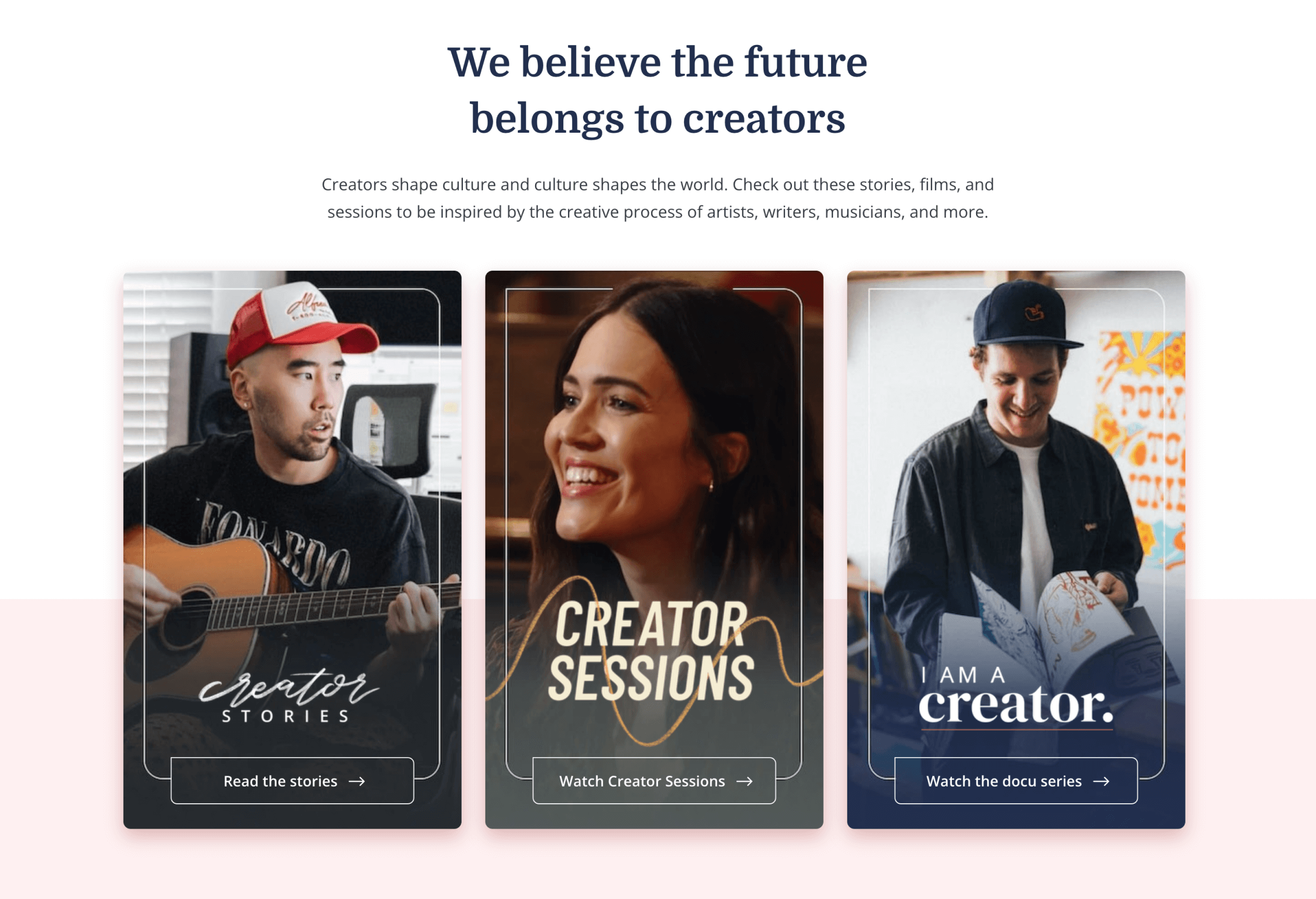
The focus on their nice continues with a focussed section of the site on creators
- As if they hadn't highlighted their niche enough, ConvertKit have even created an entire 'creators' section of their site showcasing articles, films/documentaries and podcasts specifically about their creators
- Not only does this demonstrate the power of the tool and further validate it's usage within these specific niches, it also provides inspiration for those who aren't creators yet and ideas on what they could potentially do
- Very clever as it's creating more users for itself in the future by convincing people who aren't already doing this to do it and then come and use their tool!
- Creating this community is important for them too because this inspiration helps their customers to be more successful and therefore use the tool even more
Going above and beyond with a free concierge migration
- The last part of the landing page flow is the final call to action to encourage you to get started marketing with ConvertKit.
- At this point, they offer quite a unique option where they will literally have someone help you migrate from another platform
- So keen are they to get you on the platform, if you follow this link, fill out some details, they'll assign you an expert to handhold you through the process
- This is very powerful for a number of reasons. Not least because it removes the common friction of all the effort of moving from another tool, even if ConvertKit is already better
- Secondly, it's a great way to get people to engage with the team even if they still aren't convinced. It's like a lead generation mechanism in itself as no doubt if you're still on the fence, an expert can help to alleviate those concerns as part of the process
- It's hard to imagine every SaaS company being able to offer this but again it's partly doable for ConvertKit because they are targeting such a specific group, the probably know 95% of the use cases/products they are migrating from so can automate a lot of the heavy lifting.
- There's definitely something to say for this kind of approach for very early stages of a SaaS company. It's tricky to scale but could be an immensely powerful way to gain traction in a specific niche
Finally, ConvertKit footer is worth a mention
- In the footer, they continue to highlight the focus on their niche
- Often companies will add less relevant use cases tucked away in their footer as a bit of a catch all as they don't want to leave anyone out
- But ConvertKit holds the line on focussing on their niche, again only listing the 4 key groups Musicians, Authors, Coaches & Podcasters that they highlighted above.
- As a visitor, it's absolutely crystal clear who this tool is meant for and if you're one of those 4 use cases, it's highly likely you're going to give it a try
- The other part that is worth a mention in their footer is the section specifically on comparisons. Whilst it's unlikely they are the best tool vs every single email marketing comparison, they do a great job of openly sharing the differences and highlighting where they can compete. No doubt these rank well on google too!
- So if you're thinking about these tools or already on one there are lots of reasons why ConvertKit stands out

Summary and key takeaways
- This really is a lesson on the benefits of focussing exclusively on a specific niche. It's such a hard thing to do as always feels like you might be turning a certain business away if you don't list them.
- However, this focus makes it so much easier for you to really personalise the message, provide pin point case studies for your visitors and highlight that you are an expert in that space all of which help increase conversions
- Within this niche they also do the classic trick of using very powerful (celebrities in this case) method of social proofing with numbers. If you're a creator, you're almost certainly going to see overlap with one or more of these use cases or be inspired by them
- This focus makes so many things easier to apply on this landing page starting with a clear and concise title, clear calls to action to get started, social proofing to validate the value and then if that still doesn't work, hand holding to migrate you to the platform themselves.
- Finally a word on simplicity. The benefit ConvertKit potentially has is that they perhaps get a lot of sign ups from people who have already used the tool. This allows them to simplify things. However, it's also clear that this simplicity is very intentional to drive people towards signing up and by removing all these distractions it gets users to take action in very specific places without getting too bogged down navigating around the site
TL;DR download - coming soon
Stayed tuned for the one pager to explain all of the above in a simple to scan document.